8 June 2024 |
By - Sudha Mariappan
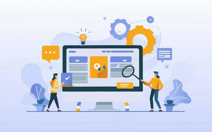
Your website’s landing page is like the front window of a store, so make it more appealing, or you’re at risk of losing your customers (viewers) forever.
You have spent time and money attracting visitors to your website, imagine the page is not attractive enough for them. Your website visitors will probably leave, just like people who do window shopping around town without buying anything.
They will be curious, but they won’t get committed.
Until the website of yours gives them something that they want. An effective content marketing helps your business and, most importantly, your target audience.
For that, your website requires more than just creative artwork; it also requires a splendid marketing strategy for your landing page that matches up with your business objectives.
And how would you know that you have turned your landing page into a place where conversions can occur frequently?
Here are some tips on how you can optimize your landing page so that visitors will convert into customers. Read our blog to learn about how you can optimize the landing page and your e-commerce site for Google search engines.
1. Creative Value propositions work wonders:
A value proposition is when you land on a website and see a statement given by the brand at the top of the landing page. It determines whether your visitor will stay on your website or leave.
Your value proposition should immediately convey why your product or service is worth your visitors’ attention. This is the heart of your landing page. It needs to be clear so that your visitors will be impressed and look further into your website for more details.
A proven method is the 5-second test to simply test your value proposition. You can show your landing page to your friend or a close one for just five seconds and ask them what they think the page is about. If they are not impressed or struggle to give a satisfactory answer, your value proposition needs more changes.
For example, Dropbox is a brand where we can store unlimited files. Its value proposition on the landing page is surprisingly simple: “Your files, anywhere.” That is it. This type of clear value proposition helps communicate their unique selling point in seconds.
2. Design for Conversion, not for aesthetics:
Aesthetics add a sense of sophistication, and visitors will feel royal when they see a good landing page with aesthetically pleasing backgrounds.
But design should never be created in such a manner that it will cost you the main function of your landing page, which is a call to action.
Your landing page design should add easy access to navigate along, highlight critical information, and most importantly, drive your website users towards your CTA (Call to Action).
You can use size, color, and positioning to guide visitors’ eyes to the important elements, like your call to Action.
Adding too much information will clutter your page, making it difficult for your visitors to read. blackspace can make your content more readable and help highlight key elements so that your visitors won’t be confused while navigating your website.
Your website should mainly be adaptable to all devices, including Mobile, Ipad, Table among others. There’s a significant portion of web traffic coming from mobile devices, so make sure your landing page looks great on all screen sizes.
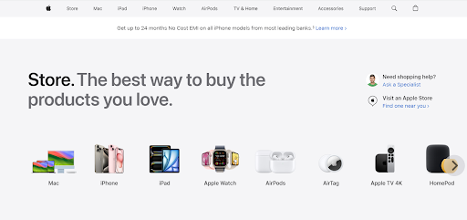
For example, Apple's product pages are masters at creating clean and sleek designs that are effective. It is because their images are large enough to see, they provide clear headings, and they strategically place Call To Action buttons so that the visitors will have a smooth experience.
3. Call To Action that sticks with your visitors:
Your Call to Action is where the visitors who visit your store finally decide to buy something. A proper Call To Action will compel your visitors to buy your products or services while visiting your website.
A weak or misplaced Call To Action can damage even the most beautifully designed landing page. You must know the psychology behind Call to Action.
You can force your visitors to take action by using language that leaves no room for doubt. The examples include “Buy Now,” “Get Started,” and “Sign Up” of strong Call to Actions.
Creating some sense of urgency with phrases like “Limited Time Offer” or “Act Now”. In this way, visitors will sense there’s an offer that they cannot refuse and will take action by clicking that CTA.
You can also produce some free resources as a call to action so that your visitors will not be forced to always have to pay. Make sure your CTA allows the benefit of taking action. For example, if they click on “Get Your Free Trial,” it’ll be more enticing than just the “Sign Up” CTA.
The best example of this would be Amazon. Amazon’s Call to Action often stresses the convenience and benefits of making a purchase, they use “Add to Cart” or “Buy Now with One Click.” to create a sense of urgency.
4. Add some Social Proof to gain trust:
Humans are social creatures, and we normally tend to follow the actions of others. Social proof such as testimonials and reviews, helps newcomers to the website trust the brand and build credibility.
By looking at the positive testimonials on your website, visitors are more likely to click on that Call to Action and recommend it to their friends or acquaintances.
These social proof usually include,
Customer Testimonials: Highlight the positive feedback you’ve gotten from satisfied customers.
Case Studies: Show your success stories. Your landing page is the only way you can flaunt your success stories. It’ll help your users to know where you stand in the market as a brand.
Ratings and Reviews: There is not a single business where there are no ratings and reviews, including small businesses. Where the world is living by trusting ratings and reviews, it is only fair that you feature user ratings prominently to add confidence among your visitors.
For example, Airbnb uses reviews and ratings extensively to build trust and encourage bookings. They highlight the number of reviews and the average rating score right on the listing page.
5. Use A/B Testing for Continuous Improvement:
Optimization is not something that we do one time and call it a day. It is an ongoing process. With A/B testing, you can make data-driven decisions to continuously improve your landing page.
Formulate a Hypothesis: Identify what you want to test (e.g., button color, headline) and why you think a change will make a difference.
Create Variants: Develop two versions of your page: the original (control) and the modified version (variation).
Split Traffic: Direct half your traffic to the control and half to the variation.
Analyze Results: Use statistical methods to determine if the changes improved your conversion rate. Analyzing A/B testing results is crucial for understanding which variation to adopt or if adjustments are needed.
Optimizely, a leading A/B testing platform, provides case studies where minor changes, like altering a CTA button color, resulted in significant conversion increases.
6. Offer your Lead Magnet:
Ever see a pop-up where you see an ebook offered to you? A lead magnet is what you’ll offer when they want to subscribe to your newsletter through your website.
It is an incentive offered to your potential customers in exchange for their contact information. This can be a free ebook, a discount code, or a free trial.
But first, you must make sure the lead magnet is highly relevant to your target audience. Will they feel related to your ebook?
You need to provide genuine solutions to whatever problems your target audience might face. For example, if you’re a plumber and you provide solutions for plumbing, your target audience might be interested in your plumbing handbook.
Just the name and email ID suffice. Simply asking for less information will not overwhelm the visitor, and they will proceed to get the lead magnet.
HubSpot uses a variety of lead magnets, like templates, guides, and calculators, that are directly relevant to their audience, driving a high number of conversions.
7. Simplify Your Forms or applications:
As much as the content is important to include about your brand on your landing page, forms are more critical when it comes to taking action.
Forms gather information of your visitors, which is critical for monitoring conversions. You can use the following methods to simplify your forms on the website - 1. Break it up · 2. Utilize repeating sections · 3. Show and hide fields as necessary · 4. Organize forms into folders.
But the forms you add cannot be so complex, that the visitor will find them a bit overwhelming to fill.
Ask for only essential information, and try to break down longer forms into smaller, more manageable steps.
A useful trick could be enabling auto-fill to make it easier for users to complete forms.
The best example of this would be Slack. Slack’s sign-up form is simple; it requires only an email address to get started, significantly reducing friction and increasing conversions.
Turning your website visitors into loyal customers requires constant experimentation. Keep testing, analyzing, and refining to stay ahead of the competition and turn those window shoppers into loyal customers!
If you need any assistance regarding landing pages, please feel free to connect with us at info@ontogendigital.com. Subscribe to us for more interesting blogs.